Cannock and Rugeley Logo Design
For the launch of the Cannock and Rugeley Law Clinic, Theodorous Law firm had commissioned me to sketch a logo design to reflect on the region and the law. The design was sketch to appear as the clinic’s coat of arms, with the deer and the Staffordshire rope knot representing Cannock and Lady Justice’s bust and the weight grams representing the balance of law. From finishing the sketch to the client’s satisfacation, Theodorous firm provided the logo’s colour scheme, clinic’s name and website domain: www.crlc.uk.
Here are the original design sketch (left image) and the finished logo (right image).
Client
Theodorous Law Firm
Year
28/06/2022


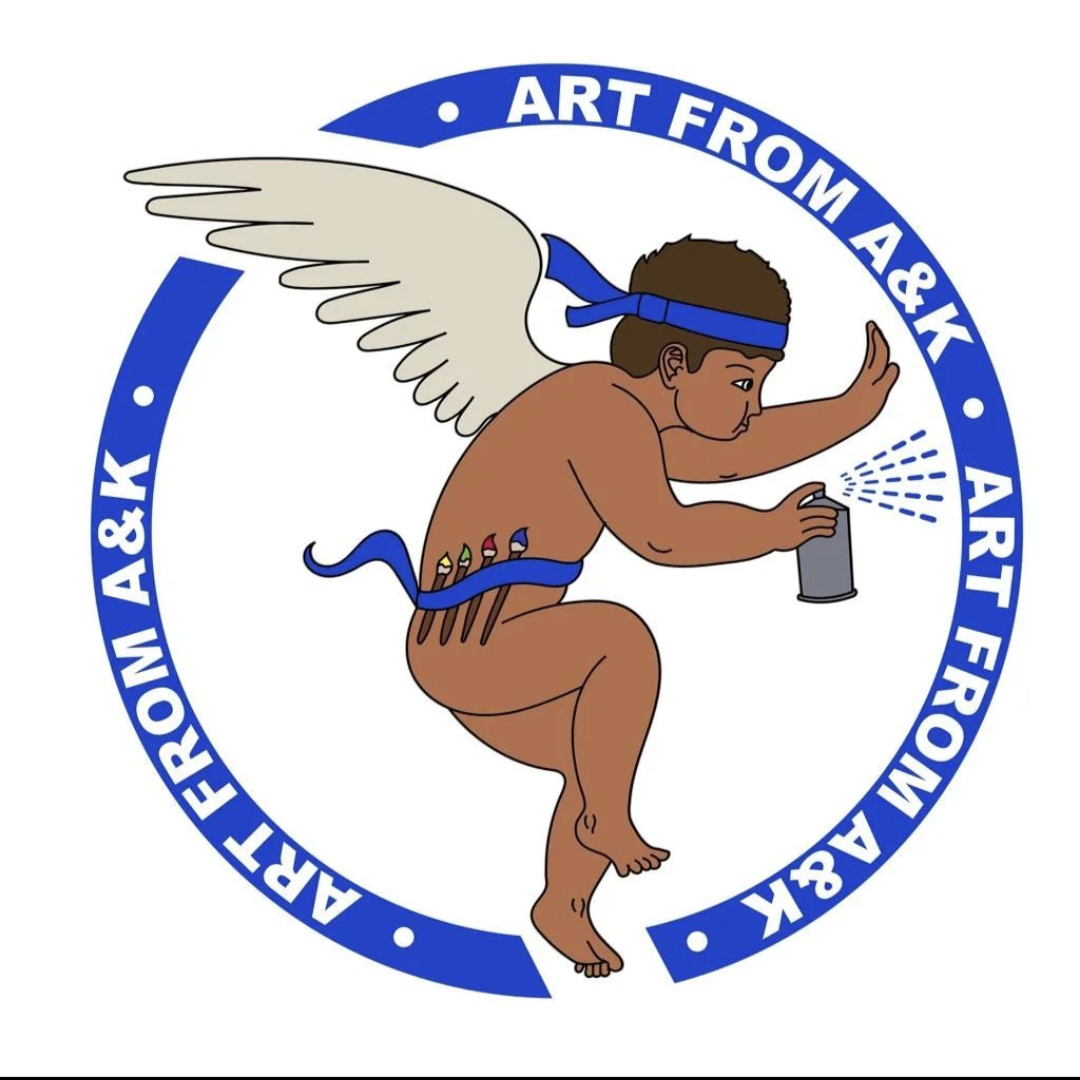
Logo Design Sketch
Art From A&K commissioned me to produce a design sketch of their logo. The logo was sketched by pencil in a sketchbook and digitised on Illustrator (see image on left). Once the sketch was completed to the client’s satisfaction, Art From A&K provided colour, business name and a few edits for their logo (image on the right). You can find Art from A&K at: https://www.artfromaandk.com/
Client
Art From A&K
Year
01/07/2022

The Spaghetti Line CSP
In Feburary 2023, Friends of Wylde Green Train Station contacted me to produce a logo sketch (image below) for a new community group, ‘The Spaghetti Line’, whose aim is to represent all the stations on the local railway line crossing through Birmingham’s Spaghetti Junction.
The community group worked from the provided sketches to create the final design shown on a banner at an Annual Stakeholder Conference held by West Midland Railway, seven months in the making.
Since its debut at the conference, the logo has been featured on an information board along the path from Highbridge Road to Wylde Green Station. You will find it along the southbound line to Birmingham.
The Spaghetti Line and its logo can by found on Instagram: @thespaghettiline.
Client
The Spaghetti Line CSP
Year
15/02/2023-26/09/2023

